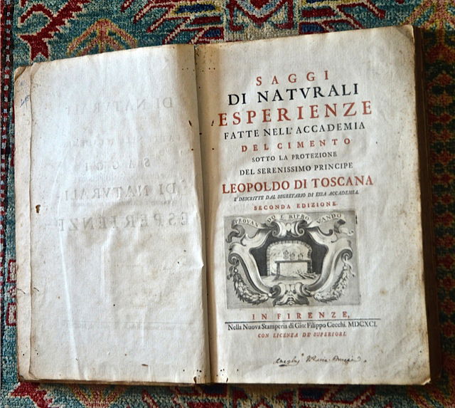
A Hungarian masterpiece in the art of the book from the Renaissance-Baroque transition period: reviving and modernising the Florentine letters of Miklós Tótfalusi Kis

One of Europe’s most beautiful printing styles had been commissioned by the world’s first ever academy dedicated to the natural sciences. Originally put to great use by the students of Galileo, these letters have now been reconstructed and modernised with great care and thus given a new lease on life in our digital era – and Atlantisz’ readers are the first to witness their revival.
The great typographer and book artist of the early modern period, Miklós Tótfalusi Kis (b. in 1650 in Misztótfalu, today: Tăuţii de Jos, Romania; d. in 1702 in Kolozsvár, today: Cluj, Romania) lived and worked in Amsterdam for an extended period of time and was as much a household name in Italy, Poland, Sweden, England and Germany as he was in Georgia and Armenia. When Giovanni Filippo Cecchi’s printing house in Florence resolved to republish the grand œuvre of the Accademia del Cimento – the first early modern academy of the natural sciences, founded by Grand Duke of Tuscany Ferdinando II de' Medici and his brother Cardinal Leopoldo de’ Medici – in a truly deserving format, the most elegant typeface available at the time was sought and found in the letters cut by Miklós Tótfalusi Kis. This new edition of Lorenzo Magalotti’s famous work “Saggi di Naturali Esperienze fatte nell’ Accademia del Cimento” was printed and published in 1691. However, its beautiful letters remained in use among many printers in Florence until the end of the 18th century.
Awarded to the most distinguished Hungarian typographers, the Tótfalusi Kis Miklós Prize bears the name of Miklós Kis. His native Misztótfalu (Tăuţii de Jos), today part of the city of Miszmogyorós (Tăuții-Măgherăuș) in Romania, set up a museum to honour his memory and achievements. The typeface he created for Florence – undoubtedly his true chef-d’œuvre – has been the subject of studies written with the greatest admiration both in Hungary and abroad; however, up until now, no one has taken on the grand project of digitizing and modernizing it to a standard of quality that does justice to the original.In line with the sophisticated – now mostly forgotten – typographical culture of the era, Miklós Kis gave distinct shapes to different size iterations of the same glyph, understanding that the human eye needs different clues when reading passages typeset in different point sizes.
