“Atlantisz Antiqua Roman”® & “Atlantisz Antiqua Italic”®

This Latin type of majestic beauty – two fonts of which, Atlantisz Antiqua Roman® and Atlantisz Antiqua Italic®, now enjoy international legal protection – demonstrates in the most self-explanatory manner how deeply and inseparably interconnected Europe’s cities and humanist traditions are in the wider context of our shared culture of literacy. Throughout the centuries, the greatest achievements of Europe’s book producers and patrons, scholars and book artists all built on one another and intertwined to form a single cultural fabric.
ON THE ATLANTISZ ANTIQUA TYPEFACE
(A note by the publisher and the typographer)
The new typeface commemorating the 30 anniversary of Atlantisz Publishing House
Since the beginnings, we have designed our books with a unified programme in mind, one encompassing both our book series dedicated to the most important topics and our consistent typographical approach in books and catalogues, on posters, in the outdoor and indoor branding and signage of our bookshop Atlantisz Book Island, and even in the graphic design of Atlantisz Publishing House’s branded Kékfrankos or Blaufränkisch wine. Our book formats are based on the golden ratio (proportio divina). We have sought a look that, while playing with classical references, is modern, serene, and yet eccentric. For a small publishing house, it is important that all its books belong together, cross-referencing one another in terms of their appearance. Books are more than mere vehicles of information; they are complex, erotic objects rich with visual and tactile impulses triggering a range of memories attached to them. It is only appropriate that a book, being the embodiment of a literary work, should also be a work of art in its own right, and so should a series of successive volumes. If that is achieved, all the books of the publishing house will become, as it were, words in a meaningful sentence – a sentence that rejects all spurious or superfluous elements.
The key components of a book’s typography are its typefaces and its printing style. We have long cherished the plan to develop our own typeface. We wanted a printing style that is clearly associated with Atlantisz, one that incarnates the very spirit of the publishing house. Our efforts have finally come to fruition.
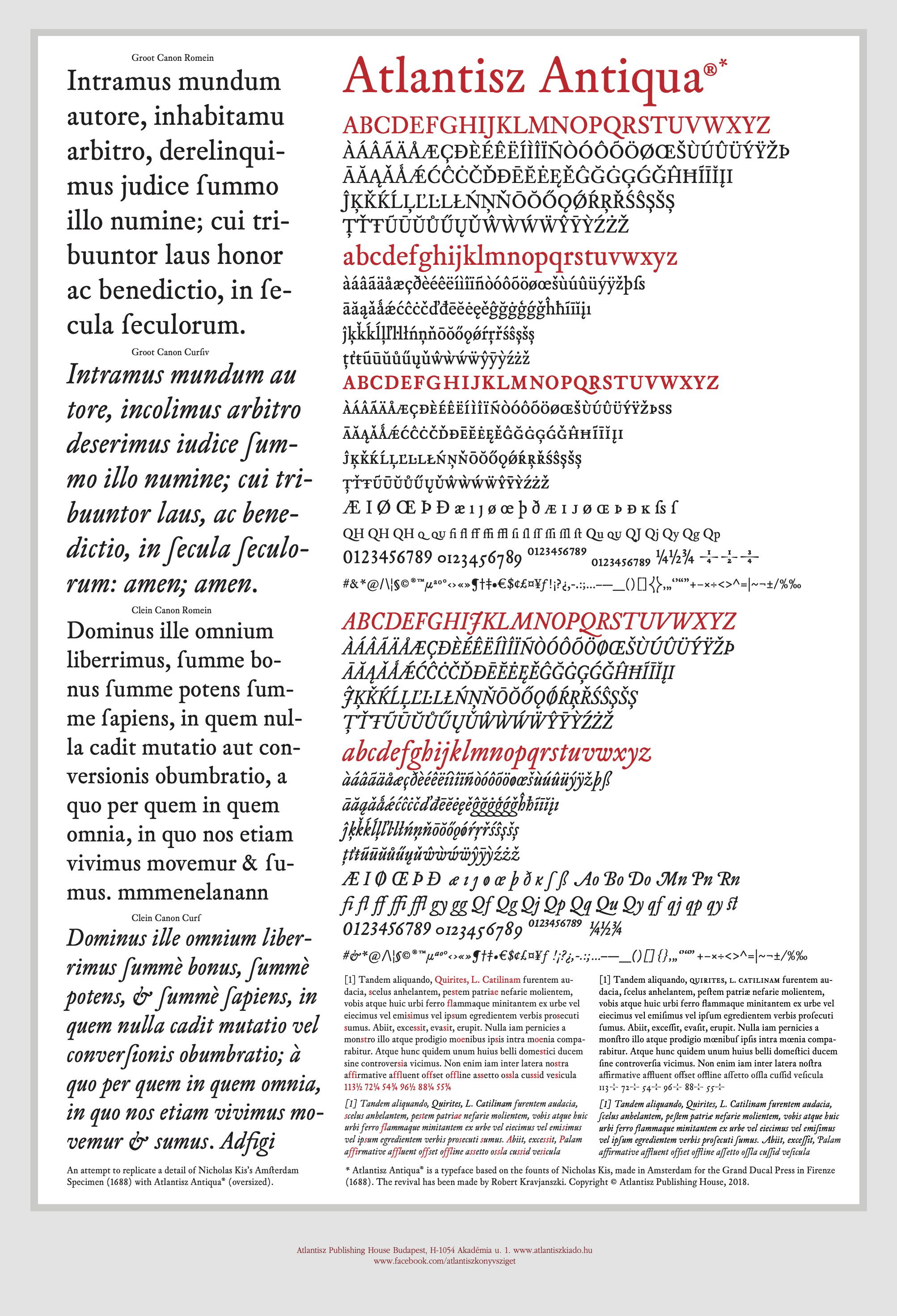
Miklós Tótfalusi Kis created some of his best work in Amsterdam at the end of the seventeenth century. He was one of the most prominent typographers of his era – and of the entire history of the printed book.He worked for English, German, Italian, Russian, Polish, Armenian, and Georgian clients – indeed, clients from half the world over. However, he created his true chef-d’œuvre for Florence when the first academy dedicated to the natural sciences, founded by students of Galileo and financed by the grand duke of Florence, sought to recruit the finest letter cutter for its books, including its first ever publication, a beautiful volume illustrated with copperplate engravings of experiments in physics. Kis designed a typeface and a printing style of outstanding elegance that, up until now, have not been reconstructed or digitized to any decent professional standard. Having chosen this old book as our starting point, we first had to find an available copy. It was waiting for us in a second hand bookshop in Rome. Atlantisz approached Róbert Kravjánszki, a member of the editorial office of our one-time social science journal Medvetánc (Bear Dance), asking him to revive and reconstruct the type and the printing style, as well as to update them to meet modern requirements. After years of hard work dedicated to the analysis and re-composition of the letters and the logic of their interrelationship, a new type was born on the basis of the 1688 letters of Miklós Kis: Atlantisz Antiqua. Our thanks are due to all those friends who have helped us accomplish this work. This Latin type of majestic beauty – now enjoying international legal protection – embodies Europe’s cultural sense of belonging together.
Our plan is to continue that work. In order to revive, as completely as possible, all fourteen sizes of the original type, and to reconstruct its Hebrew and Greek glyphs, we will need further research extending to several countries. Eventually, we would like to publish the history of this type – from the original letters cut by Miklós Kis to the birth of Atlantisz Antiqua – in a separate volume.
Our volume of writings by Daniel Defoe and Jakob de Bucquoi is the first book to be printed in this type.
Not much after the birth of the Florentine typeface, the first accounts came in of bands of sailors-turned-pirates representing a wide array of nations who – right at the turn of the seventeenth and eighteenth centuries, a good deal before the French revolution – had embraced the ideals of the enlightenment and created free pirate republics on the basis of human rights, the equality of all human beings, and the laws of reason. They had elected judges and legislated on the dignity of women. The diversity of the crews left no space for religious bigotry or racial prejudice. We still read their constitutions in amazement. Bringing text and print style together beautifully, our volume recalls the spirit of these spontaneous social experiments. It is by relaying their message that Atlantisz Publishing House wishes to salute its readership, whether they have been with us loyally for three decades or have just recently become our readers.
A brief history of the typeface
With plans to publish the Bible, Miklós Tótfalusi Kis arrived in Amsterdam in the autumn of 1680. He approached the best printers. One of them, Joan Blaeu urged him to learn letter cutting, as just about anyone could print but few could fashion letters. Kis learned letter cutting, as well as printing, under Dirk Voskens.
When in 1687 Carlo Finetti and Francesco Tempi, confidantes of the grand duke, wanted to found a press in Florence and set out for Amsterdam to find the finest printer and typographer, it was probably Blaeu, once again, who referred them to Nikolaas Kis, by then a highly regarded master letter cutter.
The book they were seeking types for had had a previous edition. Published either in 1666 (date on the title page) or, more probably, in 1667 (date of the imprimatur), this folio entitled Saggi di naturali esperienze (“Essays on Natural Experiments”) was the only volume that the Accademia del Cimento, which carried on the legacy of Galileo’s school, published during its nearly ten years of existence. The first edition had been produced by Giuseppe Cocchini’s decades-old press (Stamperia all'insegna della stella) and named Lorenzo Magalotti, the secretary of the Accademia del Cimento, as its author (the person describing the experiments).
In 1687, Finetti and Tempi joined forces with local book merchant Giovanni Filippo Cecchi to set up the press that eventually, in 1693, inherited the title grand ducal press along with all the privileges appertaining to it. A Florentine contract for a printing job dating back to 1699 mentions that, intending to fit out Giovanni Filippo Cecchi’s press with all the tools necessary for casting type, said businessmen had earlier purchased large quantities of letter punches, matrices, and hand moulds in Amsterdam from a letter cutter called Nicholas Chis. Miklós Kis later reminisced that “with promises of the best of conditions, the men of the Florentine grand duke never ceased to harass me with the proposition that I stay with them for half a year so that [...] I can show them, on their own premises, how to make use of the implements they had acquired from me”. As he writes, “they were carting cash to my quarters” in Amsterdam in those days.
The Florentine printers did not actually purchase lead types; the weight would have been prohibitive. Instead, they opted for casting the types back home, using the nearly 200 neatly packed cases of type foundry implements they bought. It was not unusual for a master letter cutter to part with his punches, even though–one would tend to think–it must have felt like having an arm cut off. A letter punch is a steel bar with the outline of an individual letter design cut into one end by the punchcutter. The finished punch is then struck into a block of softer metal, such as copper, to create a mould, which is then called a matrix. Then, an alloy of lead is cast into the matrix to produce as many types as necessary. Another tool called a counterpunch (known at the time as contrapensum was also in use to cut the production time to half when cutting punches. Counterpunches, which help give the type a more consistent look, do not carry the whole design of the glyph; they only record its most characteristic features (its stem thickness, its negative spaces, its roundness, etc.). Furthermore, the same set of counterpunches can be used to create several sizes of punches, which also helps create a more uniform printing style. Thus, when a master letter cutter, having completed an arduous journey, is about to relaunch his enterprise in a far-away country, having held on to his counterpunches (and, in fact, his counter-counterpunches or contrapensum contrapensorum, which we shall not discuss here in detail) is an excellent solution as a complete set easily fits into one’s pocket. That is exactly what Miklós Kis needed when he returned from Amsterdam to Kolozsvár (Klausenburg, Cluj) to start his own letter cutting business at home.
As early as 1691, Cecchi’s press (Nuova Stamperia) started publishing its first books using the Amsterdam letters of Kis. One was Giuseppe Nenci’s Reflessi, a horticultural manual in a small octavo format with its imprimatur dated 31 March. The other was Saggi di naturali esperienze with its imprimatur dated 2 April. Used for the first time ever in these two books, the types are still nice and fresh – that is to say, just ideal for the modern reconstruction of the typeface.
The former was rebound too tightly at one point and is now quite difficult to leaf through. In redesigning Kis’s typeface, we relied on the latter, the original, leather-bound edition of the Accademia’s science experiments. The second edition is of the same size as the first edition and features the same full page copperplate engravings illustrating the experiments, the same initial capitals, the same title page ornament, and the same logo of the Accademia. Except for the 48-point Renaissance wooden letters used on the first page, which were also inherited from the first edition, the book only uses Kis’s letters in a total of five sizes out of the fourteen shipped to Florence. In line with the folio book format, the text type is fairly large: Parangon (roman, cursive, and small capitals). However, this is a good match for the proportions of the volume and is therefore justified. While the preface of the first edition extols the virtues of his Highness Cosimo II, the second edition praises Ferdinando II.
As far as printing quality goes, it might be argued that the first edition was a job more beautifully done, as the Renaissance type was set more carefully and evenly. Line by line and page by page, the printers of the second edition mimicked the page-setting of the predecessor. However, they were using a different type, one already leaving behind the Renaissance, frequently resulted in unevenly set lines. As a matter of course, we still decided to rely on this edition for our own digitization and re-composition purposes; after all, this was the volume printed using the beautiful letters of Kis.
The digitization of the letters
When creating Atlantisz Antiqua, we started out from original prints but aimed at designing a version of the type that lends itself to our computerised production environment.
Whenever more than one size is available, a fundamental issue of digitization is which size to take as the basis for our work. While typefaces are linearly scalable in the digital world, this is not an option when physically cutting punches and casting type. In the digital world, an 18-point letter is a version of the 9-point letter, scaled up without introducing any distortion. However, in the age of classical typography, each letter had its distinct shape depending on its size (a standard that actually survived into the dawn of the digital era). Optically, smaller letters appeared bolder and seemed to keep greater intercharacter space, while letters of a greater size were more detailed, elaborate, and more gracile; they kept a smaller intercharacter space with tighter adjustment. The special beauty of old prints, which is nowhere to be seen in modern publications, is partly due to this variability within the uniform composition and these ever-so-slight differences in how letters of different sizes are fitted and adjusted.
When rebuilding typefaces on the basis of early prints, as in our case, the basis of digitization is the text type. Most commonly, the text type is the 12-point (Augustin) variety of the type. This size was indeed used in Magalotti’s edition, but only occasionally and with a small character count. In the case of this volume, the text type–the most widely used version of the typeface in a book–was the 18-point variety (Parangon). The fact that this size was more elaborate and detailed made digitization easier as we had fewer ink transfer problems (the type occasionally transferring either more or less printer’s ink to the paper than ideal for a clean print, corners filling up with ink, etc.). And since we were in fact dealing with the text type of a specific edition, we could stay true to the implicit expectations that arise from the basic principles of digitization.
To further improve the fidelity of our typeface to the original, and to evoke the long-forgotten variety that makes early prints a genuine feast for the eye, we will have to create additional sizes and variants. That is what we are now working on.
When recomposing and reviving old typefaces in our modern era, there is another fundamental issue of a technological nature. When using cast metal types, no two characters are truly identical. Every time molten lead is cast into the mould, the resulting metal type will be slightly different from the previous one. While types produced with the same matrix seem to be indistinguishably similar to one another, they are still all unique, especially when compared to the monotonous uniformity of digital characters, identical copies of each other down to an accuracy of a hundredth of a millimetre. These minuscule differences may in fact contribute to the appeal of old prints; it is a form of variability that entertains the eye and thus better facilitates reception. However, if every single metal type is different, which one should be taken as the basis for digitization? Which specific letter “a” should be accepted as the ultimate form? Here, the determining factor is the experienced eye of the type designer. Every single letter has its unique lines and specific structure; this is something a typographer must simply develop a feel for–and it is what must be given expression in a single version of the glyph. If the differences are substantial, several distinct versions of the same glyph may be designed. One cannot even rule out the possibility that a seventeenth-century letter cutter would have cut more than one punches for, say, the letter “k” – simply because he enjoyed his work just as much as he enjoyed variety. A similar approach could potentially help ease the monotony of digital typography without running into technological difficulties; the random selection of slightly different versions of the same character can be easily programmed.Wherever we ran into unusual solutions, we looked for as many specimens of the same letter as possible to see if it was merely accidental or in fact the unusual was the standard. An example could be the case of the italic “d”: the height of the rounded part to its left did not reach the height of the same rounded part of its sisters (e. g. the letters “b”, “c”, and “o”). In this case, this was the prevalent solution, hence we had to accept it. This in fact gave rise to a general principle: we opted not to standardise letter heights.
When creating a modern version of any old script, the third fundamental issue is that of horizontal and vertical metrics. Seventeenth-century punctuation practices left more space around punctuation marks. Quotation marks, apostrophes, etc. stood lower than today. In our digitization project, however, we followed modern practices. In the book we used as our model, the type designer, in line with contemporary Dutch practice, handled space quite frugally. Beyond designing fairly narrow characters, he also used tight intercharacter spaces. We have not changed the former; we have, however, allowed the letters to breathe somewhat more freely by using wider intercharacter spaces in line with modern practices. (Modern page layout systems allow intercharacter space to be adjusted freely; in fact, the typesetting can be even tighter than what was possible in the era of the original prints.)
Naturally, we have had to extend the typeface to include a number of characters that have come into use in modern times, as well as all the signs and letters that allow the use of Atlantisz Antiqua in printing or displaying texts in any language using the Latin script. When designing these letters and signs, we stayed true to the spirit of the original Florentine letters. We have also kept the alternative letter and number glyph variants of the contemporary typeface, and whenever it is justified, we will use them–they may enhance the beauty of any writing in special ways.
Earlier attempts at digitizing the typeface of Miklós Kis
The types known by names like Janson and Kis, among others, have quite a few digitized versions. However, for various reasons, these cannot be considered authentic. Each makes reference to one eighteenth-century original or another (at least the ones that care enough to try and stay true to whichever original; some of these types, as a matter of fact, merely use the name). In all probability, Kis must have left matrices both in Amsterdam and Leipzig, but was unable to sell them because, as he writes, “there were some defects in them”. This defectus may be just about anything–the series may be incomplete in terms of sizes, the character range may be incomplete, or the matrices may not have been prepared (justified) for casting. Some of these characters eventually surface, as early as the beginning of the eighteenth century, in publications printed in Leipzig.
At the end of the nineteenth century, Wilhelm Eduard Drugulin’s Leipzig press owned several matrices that may be tied to Kis. In the early 1970s, György Haiman ordered and received font sample sheets printed using types from the original matrices. These font sample sheets, however, were later accidentally scrapped.
In the second half of the 1910s, Stempel Type Foundry purchased some sizes of the Leipzig types and named the revived typeface Janson.
One of the greatest authorities on the twentieth-century art of typography, Hermann Zapf also worked with this type, extending and repairing the set, and even redesigning some of the sizes. He was profoundly familiar with his material. He concluded that over the centuries the typeset had lost its original character because of tear and wear, clumsy replacement jobs, and a variety of other reasons.
In 1922, Daniel Berkeley Updike published his grandiose work on the history of typefaces entitled Printing Types, in which he included a reproduction of part of a page from Cecchi’s contemporary edition. He named the printer and described the type as modernist in spirit. Updike may have had been familiar with Drugulin’s version since the early 1900s – he even placed an order for a smaller batch, but he never arrived at the conclusion that the two sets would have been identical. This is probably not by chance, for he was quite a keen-eyed expert on typography.
In 1954, Harry Carter and celebrated woodcut artist György (George) Buday proved for the first time that that the designer of the typeface attributed to Anton Janson was in fact Miklós Tótfalusi Kis.
The Florentine typeset can certainly be considered Kis’s work, although we do not know whether he designed every character entirely from scratch. At the time, many type foundries published font sample sheets to showcase their selection. The font sample sheets we know from the end of the seventeenth century and the beginning of the eighteenth century are of a mixed type. Type founders were not artists but craftsmen and businessmen motivated to offer the widest possible range. The typefaces they kept on stock were mostly based on their own work, but their makers also purchased punches and matrices from other master letter cutters and may have even inherited assemblages of type casting implements. Kis’s font sample sheet probably included letters he had cut himself, even though it cannot be ruled out that he had some help, or that he had incorporated other letter cutters’ work into his own assemblage, or that he had purchased or traded punches or counterpunches. (We know for certain, for example, that he only cut ligatures that were in current use at the time. His font sample sheet still features a number of unusual ligatures such as, for example, the “i-s” ligature, which is a renaissance heritage in his work. His great predecessor, Christoffel Van Dyck was known to be especially fond of these ligatures.)
We can conclude that the debate concerning whether the Leipzig letters should be tied to the name of Kis or Janson has, in a sense, become obsolete: having lost their original character, the versions going back to the Leipzig letters may as well keep the name <em>Janson</em>, since the authentic, complete and original Florentine set will certainly eternalize the name Kis.
We were the first to digitize this typeface – under support from Atlantisz Foundation, the Goethe-Institut and the Hamburger Stiftung zur Förderung von Wissenschaft und Kultur – for printing the books of Atlantisz Publishing House. Having given a new life to the typeface of the old prints, we have named the recomposed letters Atlantisz Antiqua.
Róbert Kravjánszki
Tamás Miklós